An Investing Platform Built for Learning Together
Treasury’s investing app is primarily targeted at first-time investors, and they partner with finfluencers to build online communities with a variety of educational resources. While users can invest within the portfolio area of the app, Treasury wants to streamline to process of researching and investing, and build both into any user flow in the product.
Much of the Treasury interface and feature set had been largely unchanged since launch, with limited examples of additional iterative work on most features. It represented a solid v1 that was built nimbly, but the product and communities had grown steadily and was ready for a more polished, user-friendly interface and UX.
One major goal of 2024 was the reduction of both UX and code complexity in the existing product. This would allow the Treasury team to accelerate expansion, as they begin growing the number of creator communities in the coming quarters.
Investing in Community
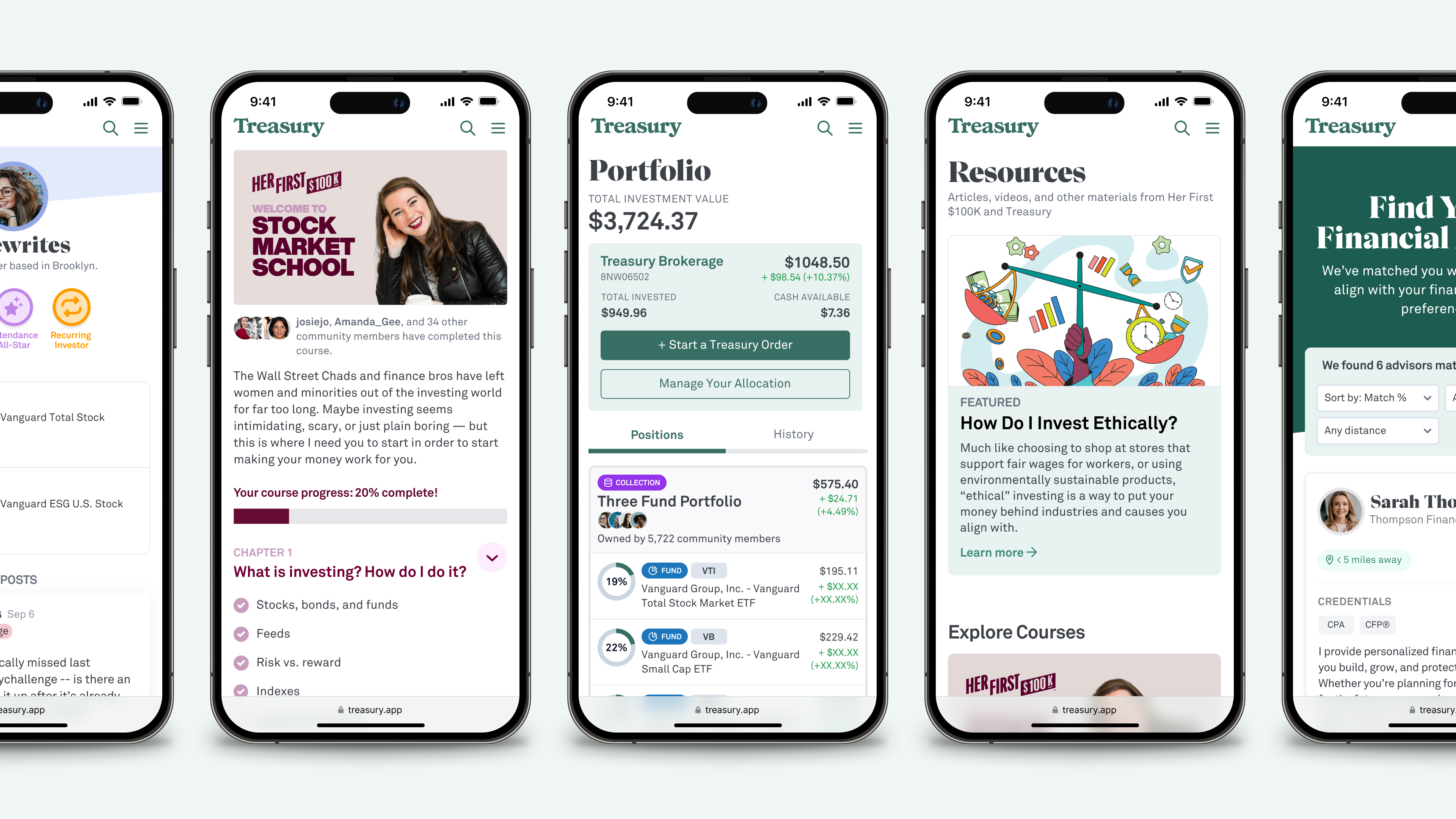
Each Treasury Community has an active forum for discussions across a variety of finance topics. Those communities also include member profiles, allowing users to see what types of investments other community members are choosing.
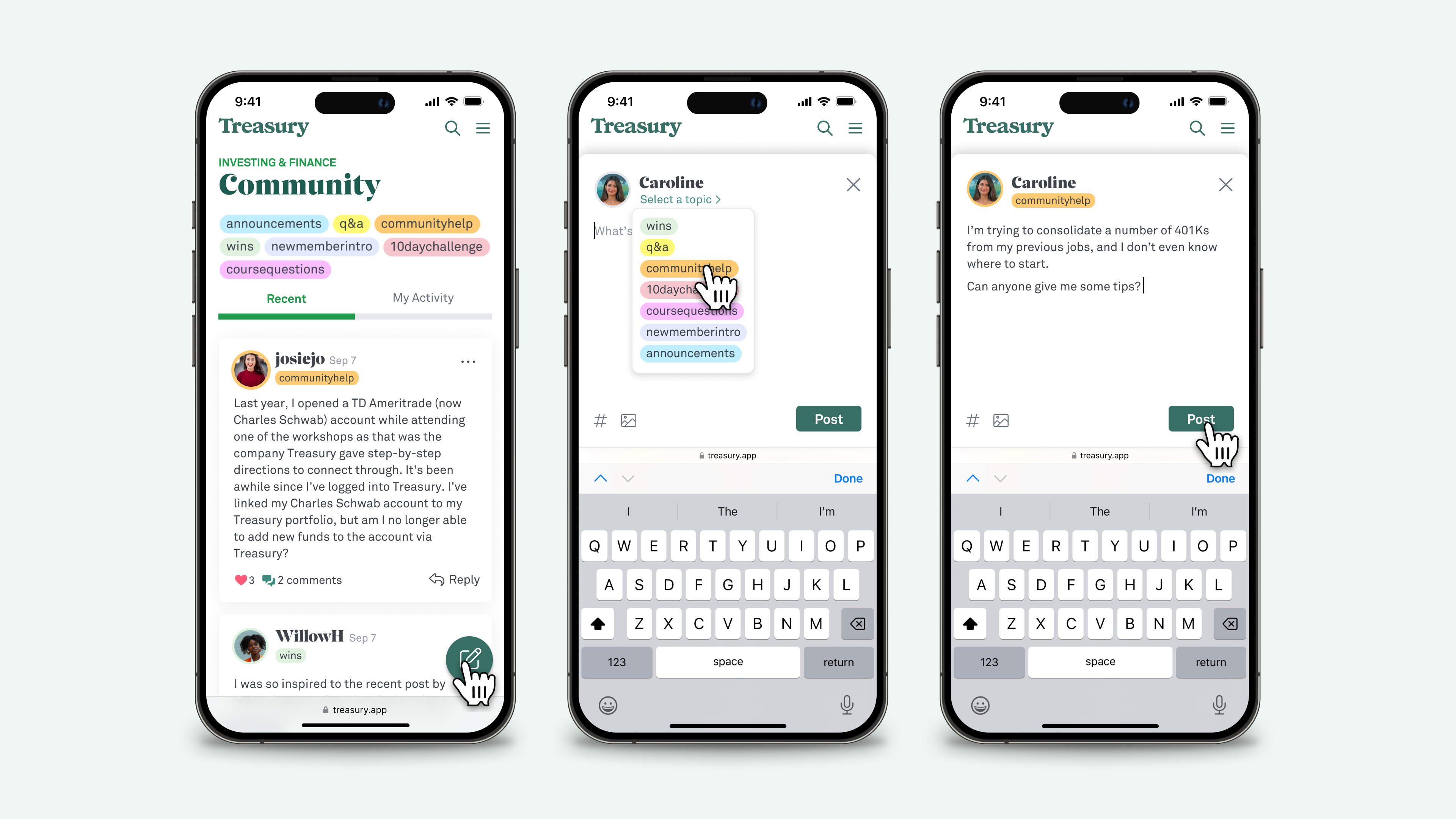
During the fall of 2024, we redesigned the member forums, making a number of UX improvements including clearer threading of messages and replies, consolidation of reactions to a single "heart", search improvements, and the addition of new "topic tags", which users could add to a message when drafting it, and which were backfilled to older messages with the help of an AI agent.
These topic tags made it even easier for users to find questions and comments with related themes, and which were often tied to specific events (e.g., "10daychallenge" and "coursequestions").
Investing Anywhere
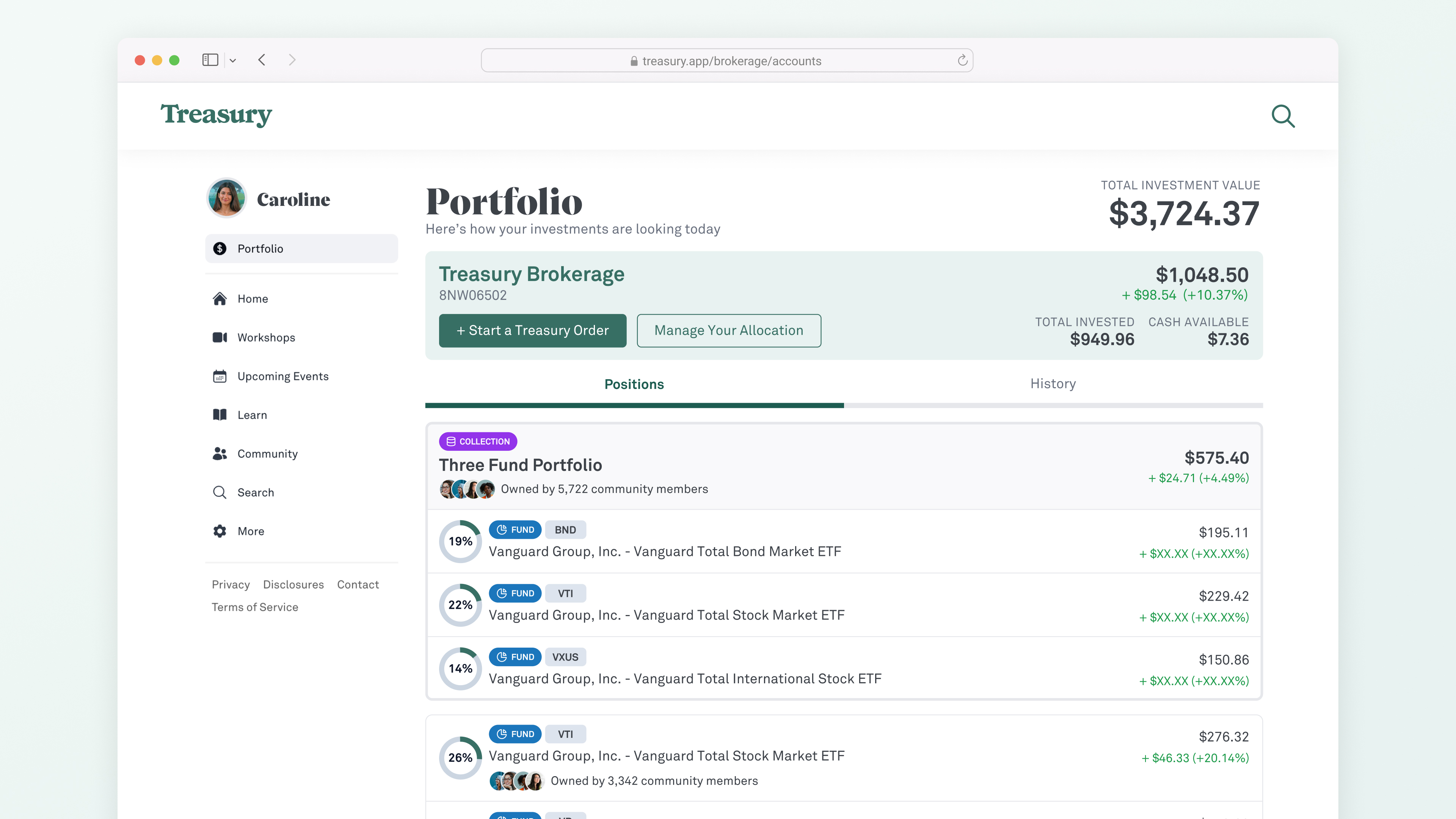
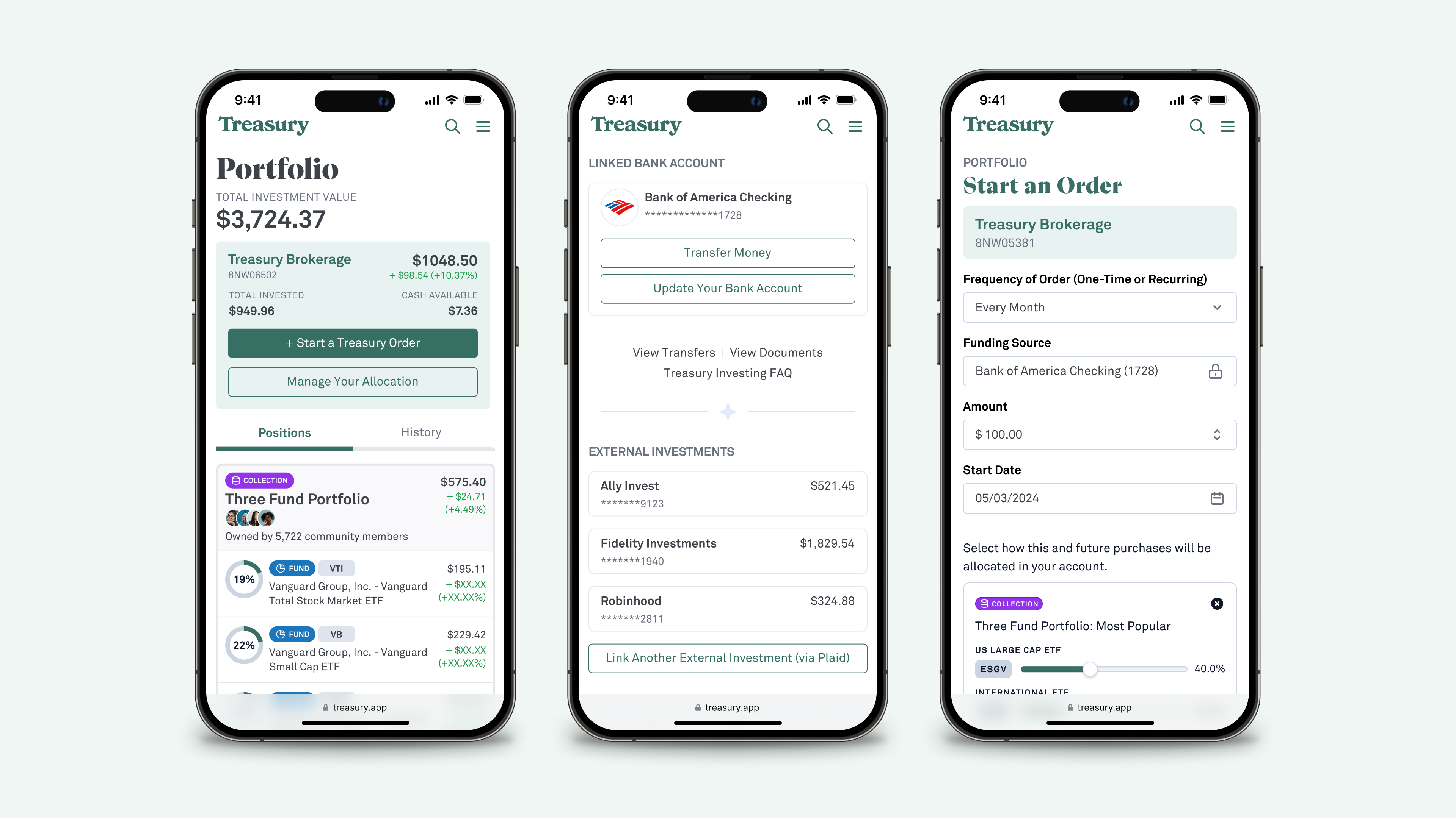
During my initial months working with the Treasury team, we launched a redesign of the app’s Portfolio, improving users’ ability to manage their Treasury investments, funding sources, recurring orders, as well as monitor external investments (through Plaid connections with other trading platforms). These improvements were well-received by community members, and we began to consider ways to expand the reach of this new UX -- i.e., how could we leverage this across the Treasury product, outside of just the Portfolio?
Any solution also needed to consolidate existing investing flows. In addition to the new Portfolio design, Treasury’s livestream workshop UI had its own bespoke research and investing flows. Any “Investing Anywhere” solution had to replace such one-off implementations.
Introducing Custom $mentions
Stocks, bonds, funds, and collections are frequently cited throughout Treasury, in community posts and replies, research articles, workshops, and self-guided courses. Enter the idea of custom $mentions.
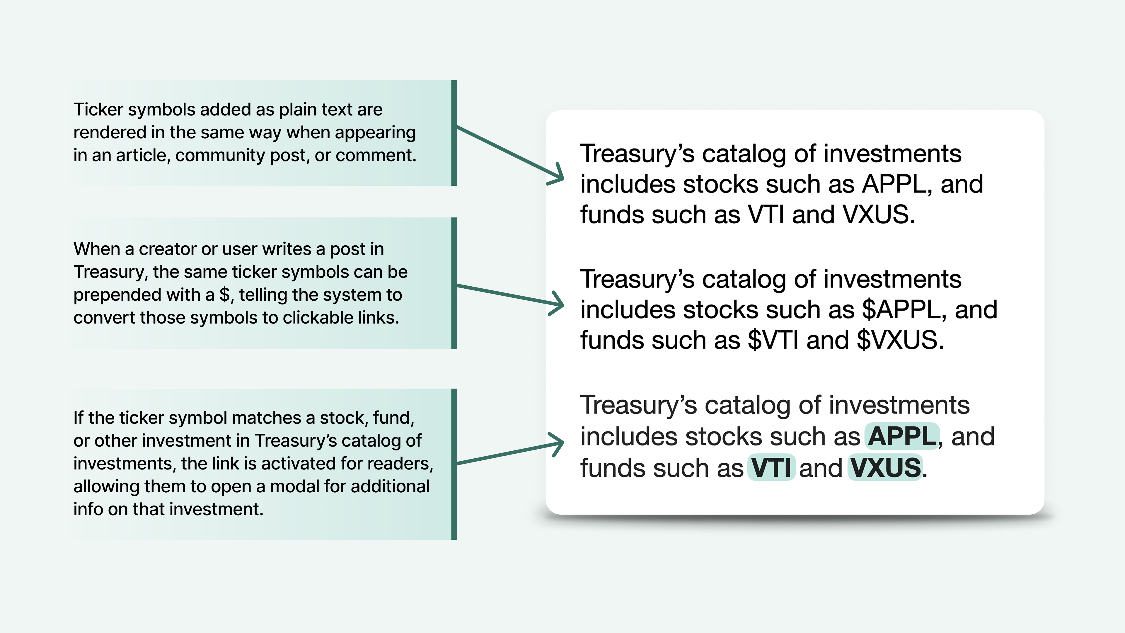
Until this time, ticker symbols added in posts, articles, etc. were written in plain text and rendered as standard HTML text. If a user or creator wanted to link to a specific stock or fund, they had to manually add the link as a standard URL (and would need to search/find the appropriate destination URL for that symbol).
By adding the ability to pre-pend a ticker symbol with a "$", we introduced a simple convention that users could easily learn and adopt. If a symbol in a post or article followed a "$" (e.g., $AAPL), the system automatically converted those symbols to clickable links.
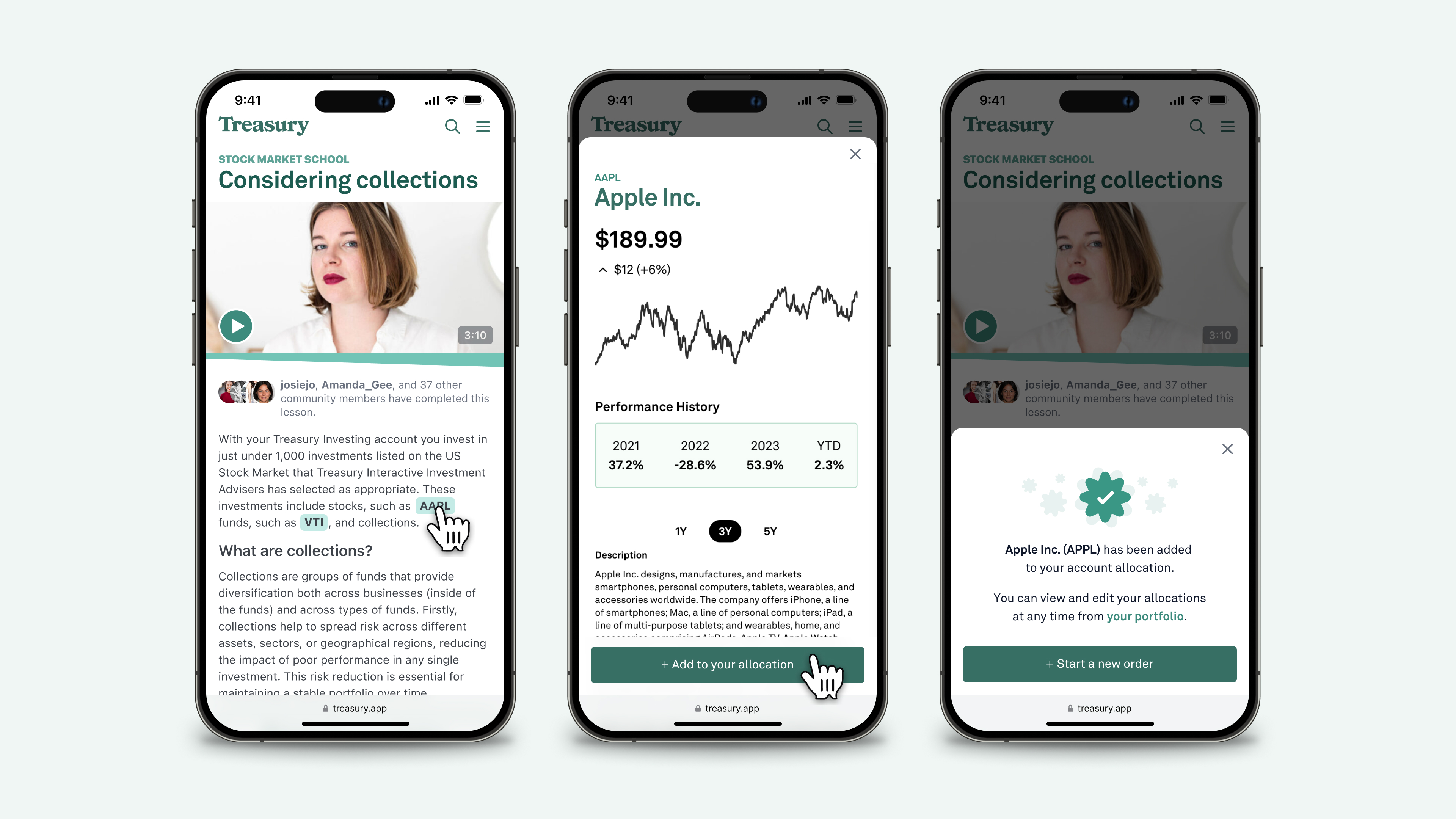
If the ticker symbol matches a stock, fund, or other investment in Treasury's catalog, the link is activated for readers, allowing them to open a modal for additional information on that investment (all without leaving their place in the app). From this modal, users also had one-click access to add the investment to their allocation (meaning it would be included the next time they invested via their Treasury brokerage account).
Marketing Design
In addition to my work on product and UX improvements, I also took on a substantial amount of marketing design work for Treasury. The centerpiece of this was the design of their first proper, full-featured marketing homepage, which I was also tasked with building via Webflow.
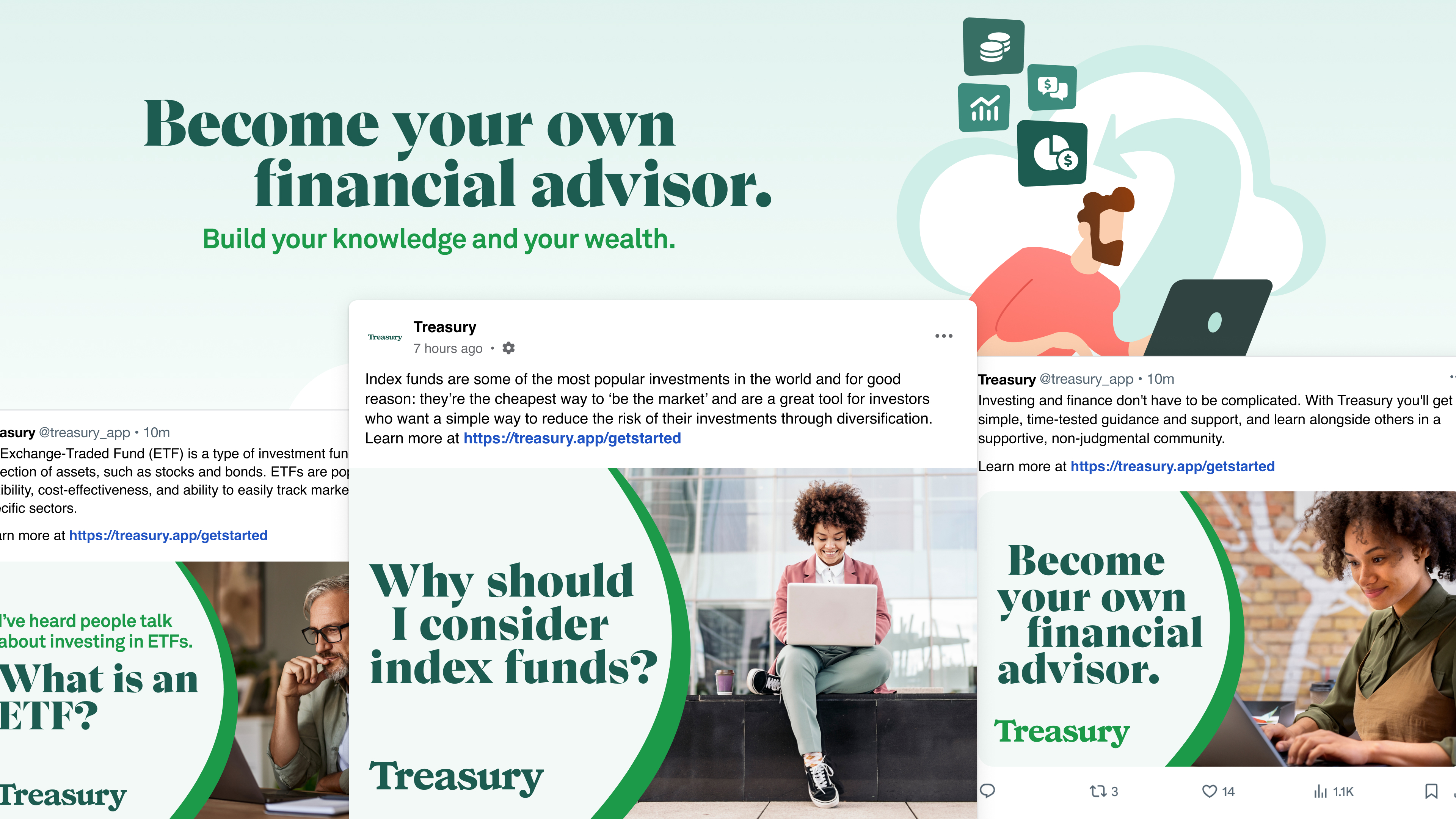
The work on the marketing homepage helped us define a visual language that was anchored in the new look and feel of the web app, but extended that style with illustrations, photography, and other visual elements. We eventually extended that marketing design system to Treasury's social media accounts, and prepared a library of post templates for use on Instagram, Facebook, and for online ad buys.
